Brown Safe Mfg. Homepage Revision
July 2016
Premise
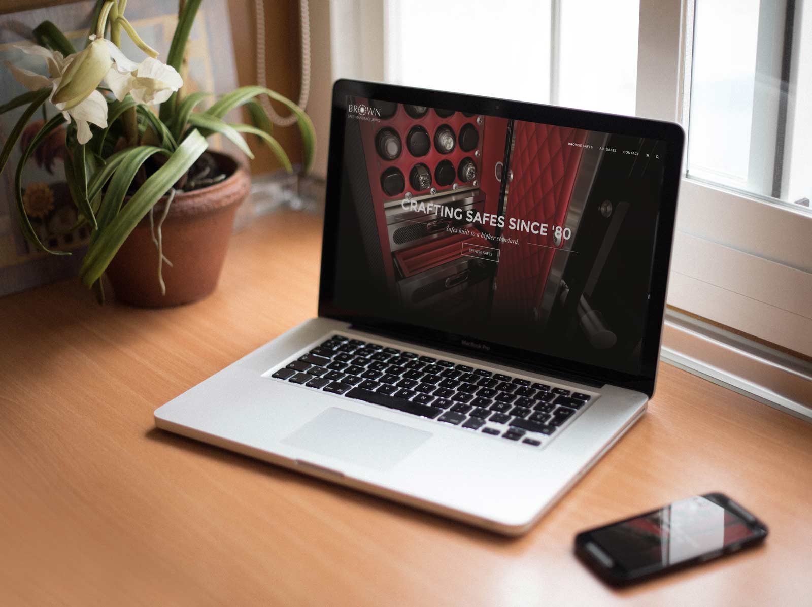
After working at Brown Safe Manufacturing for over a year, I came to know of a majority of the issues customers experience when navigating the website. I presented to the media team a new homepage and a new navigational design. The objective was to help customers navigate faster and easier around the site.
What I Did:
Organized Meetings
I organized individual meetings with: every sales employee, the COO, the VP of R&D, and the Creative Director. The objective was to gain insight on: the current design, what needed improvement, and what worked fine.
Streamlined UX
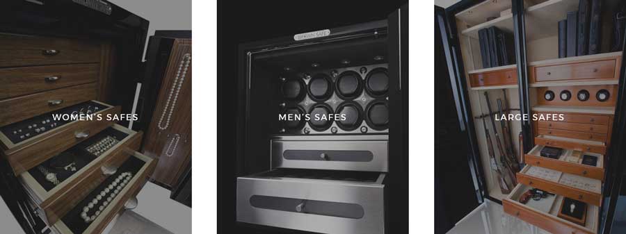
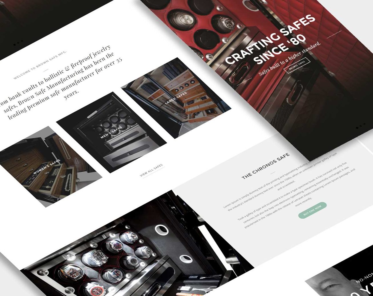
I created a new version of their homepage, incorporating shortcuts directing customers to the most popular pages.

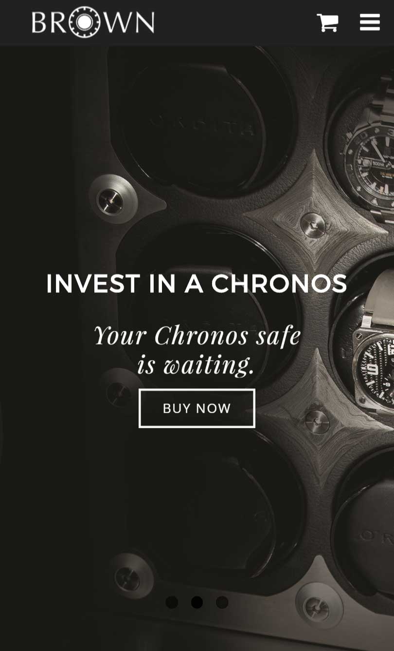
Focused on Mobile Experience
On mobile devices, I spent extra time on the navigation bar. The style and sizing was made precise on every screen resolution. Ferrari‘s website’s navigational bar was used as a reference. On desktop the navigational bar is non-obtrusive with a clear background fading into dark-grey upon scrolling down.


Images
I retouched, scaled, and web-optimized existing images and created new product imagery for this demo. I also revised their current logo in Illustrator and exported to SVG for the demo.
Implementation
Most of my ideas have been implemented; such as:
- The shortcuts on the homepage have been added.
- The slider with some of the images I created has replaced the old slider.
- The layout of the homepage is similar to the demo.
- The navigation almost mimics the one I proposed.
The mobile experience has been neglected after the team implemented changes after I left.

