SimmiMega: Micro-Game Making Machine (Dev Log #2)
After the last dev log, I was trying to wire the resistive touchscreen wires directly to some of the unused analog pins left on the ESP-32, but I realized I didn’t have enough pins left. Some of the pins on the ESP-32 were input only, and some didn’t support analog reads. Instead, I ordered some SPI resistive touch controller chips.
Now, let’s go over the process I took to design the user interface.
User Interface
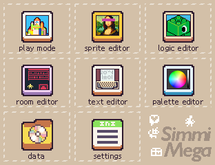
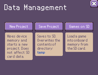
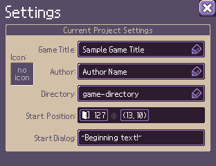
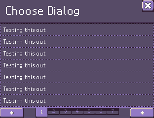
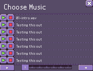
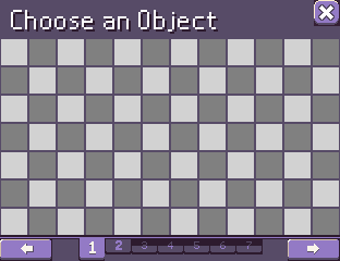
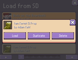
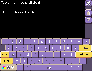
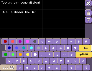
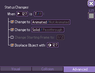
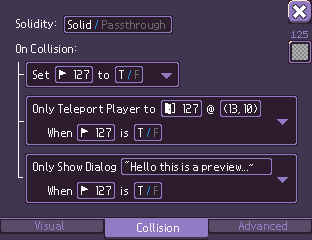
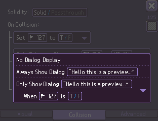
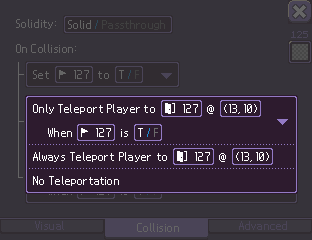
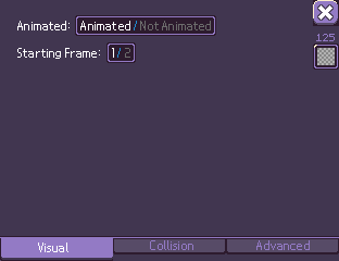
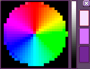
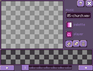
First, I made a minimal viable version with just colored boxes and simple text. I did some tests on the actual ILI9341 screen, testing colors differences, size of elements – like what’s easy to press versus too small. After laying out the screens, I began searching for some sort of reference.
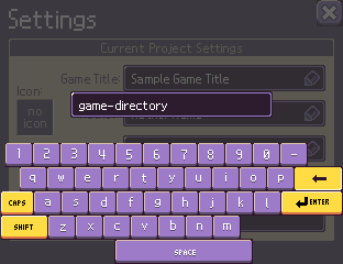
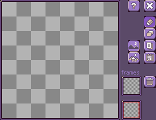
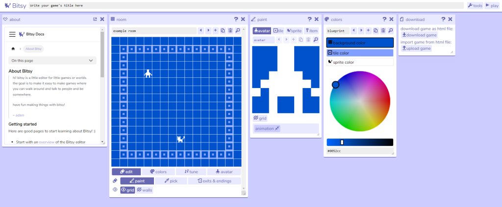
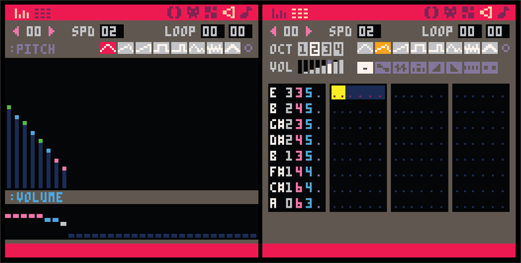
To look for UI reference, I browsed through Pinterest simply pinning the things to a board of things related to the project that I liked, styles, colors, etc. I specifically looked at how other fantasy consoles such as PICO-8, Bitsy, etc. handled their game editor interface. I wasn’t the biggest fan with their implementations. For instance, font size in PICO-8 is just a bit too small (for me at least) to be comfortably readable. The Bitsy editor was nice and re-arrangeable but a bit too monochrome and uninspiring.
Then I stumbled upon a fantasy console called PV8 or PixelVision 8. The editor is absolutely gorgeous with the user interface art created by Christina-Antoinette Neofotistou, a former pixel artist for Mojang. This was by far the best fantasy console editor design so far, and it became my main reference. The best part was it all under the Microsoft Public License! (derivative works, commercial usage, open source *chef’s kiss*)
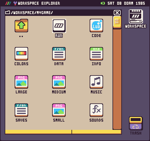
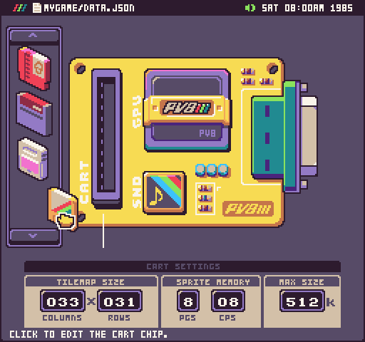
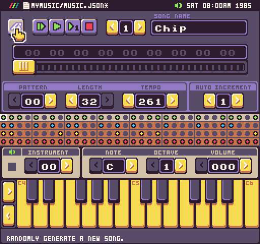
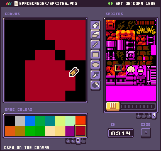
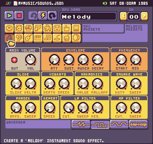
Finally, I used an app called Miro to map out the user interaction flow to make sure I have total coverage before programming. (I finished the UI design earlier, before the fall quarter of university began.)
User Interface Mockups in Photoshop
